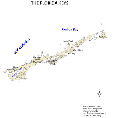
Getting better at manipulating Adobe Illustrator. Still a challenge but will improve with more practice.
 This was my first time to use Adobe Illustrator. It was a challenge trying to label the map while learning the software at the same time. I was unable to place a frame line (using Illustrator) to help organize the content of the map and to define its extent. It would have been nice to place thematic symbols on the map and a legend to define them. Due to my limitations with Illustrator, I was unable to accomplish those tasks.
 This chloropleth map shows the percentage of African Americans in Escambia County, Florida using the natural break method of data classification. I feel the natural break method is the most appropriate for the data; looking at the frequency distribution of "p_black" (see below). Natural breaks minimize differences between data values in the same class and maximize differences between classes. For this reason, I feel natural breaks is the most appropriate.
 This is a bad map because it lacks all the qualities of a good GIS map design. This map lacks any meaningful labeling, has no title, no idea what the map maker was attempting to display. Overall, no substantial map information was shown on this map; in other words the was no "Concept before Compilation.
 The title of this map is